 As winter approaches, I start to miss the summer so much and especially the beach. I really love this picture, it captures such an unusual event , a family of dolphins being playful with surfers. This picture captures time so well, and is all about the decisive moment. As the huge wave comes in and frames the picture , the water just beginning to slash , the dolphins look like they are having a blast riding the wave while the surfers are the spectators. The colors and contrast on this picture is filled with cool colors. There is good lighting and one can even see the reflection of the dolphins in the water right in front of the surfers. The rule of 1/3 also can be seen horizontally and that gives us an idea of how calm the ocean looks from a distance, how big the wave actually is as it towers over the calm water where the surfers are. While the surfers are surprised trying to figure out if they are dolphins or sharks, they look calm and not moving away but looking in awe. I think this is a good example of a tableau picture because it tells a story.
Friday, October 28, 2011
Playful Dolphins
As winter approaches, I start to miss the summer so much and especially the beach. I really love this picture, it captures such an unusual event , a family of dolphins being playful with surfers. This picture captures time so well, and is all about the decisive moment. As the huge wave comes in and frames the picture , the water just beginning to slash , the dolphins look like they are having a blast riding the wave while the surfers are the spectators. The colors and contrast on this picture is filled with cool colors. There is good lighting and one can even see the reflection of the dolphins in the water right in front of the surfers. The rule of 1/3 also can be seen horizontally and that gives us an idea of how calm the ocean looks from a distance, how big the wave actually is as it towers over the calm water where the surfers are. While the surfers are surprised trying to figure out if they are dolphins or sharks, they look calm and not moving away but looking in awe. I think this is a good example of a tableau picture because it tells a story.
Thursday, October 27, 2011

I decided to post a photo from the photographer I am doing my report on, Weegee. This picture is of two fugitives who are in a police van about to be taken to jail. Weegee usually worked at night and listened to his police radio where he would find out where the crimes were occurring. He constantly used flash considering the time of day and it is evident in this picture by the light distribution in the closed area. The photo itself is very interesting because it is a view that not many people are able to see very often. The distribution of the objects and people in the photo is very interesting as well.
Muhammad Ali versus Sonny Liston

Photograph by Donald L. Robinson
This is one of the most famous sports photos in history. It depicts Muhammad Ali knocking out Sonny Liston in the 1st minute of the 1st round of the fight. This photo has hung in my room for years so I figured it was a good one to post in the blog. At first glance, the eye is drawn towards Ali and his powerful pose of dominance over Sonny. But it is really the photographers point of view that allows for Ali to look like that. The photo was taken at the height of the opponent on the ground. This helps put the viewer in the fight and allows us to really see how intimidating and dominant Ali was. When looking further, you start to notice the photographers on the other side of the ring and the crowd in the background. This allows the viewer to get sense of the magnitude and importance of the moment that was so perfectly captured by Donald Robinson.
Sunday, October 23, 2011
The Snow Queen

This photograph seems to bring out two different sides when I look at it. First, it looks like a cute innocent child on a wintery day, but there also is a creepy and mystical appearance about her. She is not looking exactly at the viewer, but just over your shoulder. Her eyes perfectly match the color of her jacket and the background. What could she possibly be looking at? Is she upset or happy? Also, the colors in this photograph help provide for the viewer to feel the cold winter day. The fur on her hood looks as if it is snow and it is intertwined into her blonde hair. She also somewhat flows into the background on the photo and it is very hard to tell were she ends and where the background begins.h
Into the Expanse by Johan Eldrot

This photo was taken from the iheartphotograph blog. This picture doesn't have much too it, but for some reason I found it very interesting. The thing itself is clearly shown in this picture as the few posters against the wall. The framing of this picture just shows a corner of the room. Because of this you cannot see how big the room is, or if the other side is not as plain as the one photographed. One of the things I loved about this picture is how the wall and carpet are both white, but the posters are bright colors. Since the carpet and wall are white the posters really stand out in the picture. This picture could a show a new homeowner decorating a house or someone trying to reinvent their room for a fresh start.
Thursday, October 20, 2011
i heart photograph; Sara Condo; MJ 23; 2009
 The thing that caught my eye immediately in this picture was - most obviously - the cutout of Jordan. After I examined the picture a little longer, I realized that the picture was deceiving in one major way: although it is seemingly a room full of trash and discarded things, it has an eerie feel of normality and comfortability. Perhaps it is just because the cutout of Jordan makes you feel more comfortable with the room, as it sort of gives it a more relatable feel. MJ here might work as sort of a surrealist approach to our notion of humanity, or simply the things or people that make us feel at home (I'm assuming this is trash or storage in a house's garage). Jordan's facing the camera particularly exacerbates this feeling of comfortability and the deception felt soon after.
Tuesday, October 18, 2011
 I really like this picture because it captures time so well. The person running, the shadow on the wet sand, the sunset , the colors of the sky , the ripples in the water.... The colors going from very dark to very bright, the movement of the person as well the contrast gives it special effects. The extra bright sun in the sky, looks like it gives life to the water and the sand. It also looks like it gives energy to the person who is running. The wide step and bounce on the person also help with the concept of time, it gives him speed. I also like this picture because the sun is what draws you into the bright spots however the main focus is the person running and that makes you look closer to the water, and the shadow. There is also some texture seen on the sand and the waves splashing in the background.
Monday, October 17, 2011

i like this photo because you get to see how big the mountain range is. the white snow against the background of blue sky suggests that these mountains are very high up. also the choice to leave out the ground by the photographer doesnt allow the viewer to see how high the mountain really is so it makes them look even bigger. the shade against the mountain adds a cool feature to the picture.

 i like this picture because it signifies time. you get to see the polar bear in motion jumping out of the water. you see the water spraying and coming off of the bears body. the photo shows the athleticism of the polar bear, as well as the size being that it is fully stretched out. the mountains in the background give the viewer a good idea of the setting. i also like how you can see the reflection of the mountains on the water.
Sunday, October 16, 2011
I Like this photo because it seems a little bizarre. It looks funny and puzzling because it shows how erosion shapes the earth. This photo is cut between time and vantage point. It shows time because we can tell in looking at this picture that there once was a time when this tree was not on the edge of a cliff. You can tell that the tree is about to die because of the erosion around it. The tree has remained the same and the world it has changed which makes it very cool to think about as well. 

I like this photo because it stops time very well. This picture is taken of the sunglasses but the real picture is within the reflection. I think that it is a very creative photo because of how it shows the reflection of the sunset in the horizon. If the photographer had just taken a picture of the horizon it wouldn't have looked nearly as cool because the sunglasses give you a sense as if you are actually there. It is a very creative idea for a picture and I like it very much
 I like this photo because there is a lot of different stuff going on in it. Your eye is drawn in to the strange architecture of the houses at first glance. I like how the houses seem like they were cut out of stone. The stair case on the upper left looks exactly like it was cut out of stone which makes the scenery different than anything I have seen in real life. The houses frame the beach horizon which looks cool because it seems like a very tropical place.
Saturday, October 15, 2011

This is a picture of a rural field and was taken by Jennifer Joseph. The main focus of this picture is on the dead shrubbery at the bottom. The trees, field, and house in the background are all blurry. This photo is a good example of detail as you can see the texture of the dead shrubs in the foreground. This photo can also be given the theme of time. You can tell it is probably early autumn because the plants are starting to die and the leaves on the trees are turning yellow.

Rock and Monastery

This is a breathtaking shot of this extraordinary monastery located on the top of a rock formation. It seems as if the monastery and the rock that it sits on a actually one and connected, since the monastery seems to made of the same color rock as of it sits on. I like the way the road int the background is shown leading to the monastery. If that was not there, you would have to wonder how do you even get there. The red roofs look great against the green creating much contrast by using these complementary colors. There is also great detail in the rock formation showing even little in and out of it, even though the photo seems to be taken from some distance away.
Giraffe
 Is this photo's main subject the beautiful and colorful sky or the giraffe in the foreground. I believe that both play an important role in defining this photo. When most people think of giraffes, they think of a deserted area that is pretty bland. But when you look at this photo, the sky and the setting sun jump out at you and show truly how beautiful the land that they inhabit is. The sun is lighting up the other side of the giraffe, making the side facing the photographer totally dark and lacking details. That is why I do not think that the photo is about the giraffe specifically, but more of the idea of the giraffe and where it lives.
Stars 2
 There are three main things going on in the photo. First, in the foreground you have some pillars that do not have any lights on them. In the middle of the photo, almost all of the pillars have lights on them. Then in the foreground, there is a bright city skyline which almost dominates the brightness of the lights on the pillars. However, it is known from the title of the piece that the focus should be about the 'stars' on the pillars. This then tends to make you think about this piece as if it were outer space. The dark sky being the water, with the stars sparkled around the sky, and then having Earth in the background of the photo, bright and vibrant. I do not think i would have ever thought of this connection without the help of the title.
Wheel
 What grabbed me to choice this photo was not the fact of the subject matter or that it had great detail, but it was the creepiness of it. It is a photo of an old decrepit ferris wheel that is completly rusted. The are a couple of weird thing about this photo. First, the fact that the signs in the foreground of the photo, although having old designs, they do not look to be rusted or showing age. There are no people around also proving the point that it is old and deserted. Also, the sky plays an interesting role in this photo. It seems at first to be on a gloomy and dreadful day, however when you look at the top right of the photo the sun is definitely out. It seems that this photo might have been edited to give it a more creepy and vacant look.

This is a picture of a building taken from inside a window. This photograph was taken by Jo-ey Tang. This photo is a really good example of framing. The photographer did a really good job of making sure that each edge of the window was caught to give the photograph the illusion of having a frame. This frame causes you to focus on everything within it. I also like the theme of rectangles. The outline of the photo itself is a rectangle and then the windows within the photo are all rectangles and are all pretty symmetrical. There are also some little rectangles within the railing. This photo also shows time. The sun is casting a shadow from the left hand side so you can tell it is either early in the morning or late in the day.
Bokeh Photography
 As first, this photo looks completely fake. I think it is the perfect circles of different colors in the background that give me this feeling. Almost as if they have been photoshopped in. However, after taking a closer look, you can tell that they are not. The scene that this photo is setting up, is a classy dinner on the side on a boat or dock. The lights in the background are coming from across the water. An interesting piece of this photo is that you can see the reflection of what looks like to be a city in the red wine. This brings in multiple layers to the photo and takes it away from looking like an advertisement.
Friday, October 14, 2011

This photograph of a starfish was taken by Jochen Lempert . This photograph is a good example of the thing itself. The photograph is in black and white which gives the illusion that it could have been taken a long time ago. The background is alternating black and white squares and looks like it could be a table cloth. The starfish is centered and your eyes are immediately drawn to it. This photograph could also be an example of detail. You can see the texture of the starfish and you can tell it is rough and bumpy. The background appears to be a cloth-like texture. The thing about this picture that really stands out to me is how random it is. There does not seem to be any connection between the starfish and the checkered background, which makes it interesting to me.
Busy City

This photograph is called Busy City and was taken by Vincent Chen. I really like how this picture captures time. A lot is going on, people are walking, cars are driving, and a lot of lights are on. The photographer did a great job of “freezing” time. You can tell the cars and people are moving because some of them are blurry. I also like how the taxis at the bottom draw the attention of your eyes and then continue up the street in a line.
Beauty of a Valley

The picture I have choosen to blog about this week was taken from the play with fire photo blog. This picture was taken by Kyle Scully. I love pictures of nature and I came across this picture of a valley while looking through the blog. This picture really works for me because of the beauty of the picture. The framing has mountains on both sides of the valley and frames the river and emptiness between the mountains. This picture also shows the sun shining between the mountains which allows you to tell what time of day it is. Where the sun is shining also reflects where the trees are growing. The sky that is shown in the background looks crystal blue, almost light purple in a way. The vanity point is not taken above or inside of the mountain but rather in between the mountains so that you can see how big the mountains really are. The sparse amount of trees in comparison to the mountains look extremely tiny.
Brooklyn Bridge (1947) By Arthur Leipzig

Pony Feathers (2011) By Edward Steichen

This image has a good contrast to it and is a good example of the thing itself. There is also a certain degree to which this image is also an image involving frame. The skirt just barely reaches and hugs the frame. I also like the use of shadow and the attention drawn specifically to the skirt, the shows and the top of the stockings, and how it is done in very different ways, and tones. There is no uniform tone in the image. The background does not take away from or distract from the thing itself. There is also special attention paid to detail. The thing itself and detail play into each other very well. This image reminds me of a photo in the exhibit “After the Gold Rush” called “Walking Gun”, that shows the armed and dangerous woman, which is shown in a slightly different way in terms of content, but the form has similarities, starting with the heels. In “Walking Gun” there is a literal weapon, but this weapon is more symbolic, which I find successful in this image.
The California Street Firehouse By Ansel Adams

I like the use of lighting in this image. It probably best fits into Szarkowski’s important detail concept of detail because each little detail of the “Firehouse” is shown. There are many different shades, and the image is not muddy. The contrast in the image is sharp and well done. There is a subtle amount of backlighting done in the image, where the darkness acts as a frame for the building. There is such a range of tones in the image, which allows each detail to stand out in the image. The eye is drawn to the light close to the center, but slightly to the right. This also shows the rule of thirds fairly well with the way the building is constructed. There are three clear parts to the image. The ends have a darker tone to them than the middle. There is a fun amount of geometry involved in the image as well. There are triangles, irregular pentagons, flower-like shapes, diamonds, rectangles and circles in the image, making it more interesting, and enhancing the wonderful level of detail.
Untitled By Jessica Dean Camp

I like this image because of the vantage point, and the context that the hands bring into the image. Without the hands and arms, the image would fall flat. Camp also uses the lower right hand corner of the image to capture the viewer’s eye as we mentioned in class. There is a certain amount of framing that the hands do, separating part of the foil and other paper. I like the crinkles that allow for darkness and light in the background. I also like that the background is in focus and the hands are not. This is difficult to do successfully in an image. This blurriness also lets the image also fall into the category of time, which I believe adds to the image, and creates a sense of urgency and desperation. I also like that there is more crinkle in the foil at the top center, bottom center, and side centers, providing a certain level of framing for the white sheet. I also like that the sheet is not completely symmetrical. It adds more dimension to the image and the hands do this as well.
Tetons and the Snake River

I was drawn to this image because it provides a beautiful contrast, and each part of the image is alive. My eye is drawn to the lighter parts of the image, which are the snow covered mountains and the body of water. These parts of the image have beautiful shape to them. I also like the light popping out above the clouds on the upper right hand corner, a place my eye doesn't always wander to in photographs. This image has the concept of detail down very well, one of the concepts Szarkowski finds to be important in images. Each little detail of the scene is focused on, but that does not take away from the beauty of the entire image itself. There is also a subtle reference to time with the sun poking out of the clouds. I like that there is a light part to the clouds but a dark part as well, showing the light behind them very nicely. I like that the trees frame the body of water as well.
Thursday, October 13, 2011
Niagara Falls

This is a really cool use of a slow shutter speed. The falls run together to make a silken blanket flowing in the wind. The farther shot of the falls brings it all back into perspective and the fog is the curtain to reality. It gives the viewer a choice to either view the almost granite-like structure of the falls when stopped this way, or to view the smooth rolling water. Either way it show two completely different dynamics to the waterfall. All around a beautiful picture.
Woodland Steam, Winter

This picture is very interesting in how desolate winter can be. There is a lot going on in this picture; from the dormant trees to the lake and to the snow. The lake itself has a very interesting shape to it and the trees do not overwhelm the background. It seems as if it is somewhat of a clearing. It doesn't seem that the ice is frozen yet and the fog throughout the photo gives the entire picture an eerie, desolate feel.
Hiroshima, Japan 1987
 The picture itself did not really catch my eye until I saw the title. It's a very simple piece (hehe) that has some meaning on it's own in that a cigarette pack has the word peace on it. However, when the title of Hiroshima 1987 comes into play, it takes on a whole new meaning. This, of course, is in consideration of the bombings and the fact that the pack of cigarettes is beaten up and alone can really speak for the damage that was done many years before by the nuclear bombing that took place there.
Ellis Island

This is such a great example of framing I can't stand it. The picture came from an anniversary commemoration of the Statue of Liberty. It shows the statue in full form and it's silhouette in the distance is enhanced by the power lines. The grid the power lines create gives an industrial feel to a landmark that symbolizes immigrants having industrial jobs and able to make themselves apart of the country. I think the desolate poles at the bottom of the picture also give a theme of better things beyond the horizon. It is a very interesting way to show the Statue of Liberty.
the Future

I really like how this picture's cut in half by the edge of the house. It is as if the woman wants to cross into nature because of her fascination, but it also seems that she cannot lean any further out of the window considering the angle she's already at. The angle that the picture is taken is interesting too, it's not a straight side shot where she is just leaning out, but it gives more of a showing for the depth of the house and gives a hole kind of feeling.
Life - Man of Steal - Jay Directo
 This picture is of a 35 year old man posing with his collection of Superman memorabilia. What I like most about it is the sense of deception that you feel with the juxtaposition of a real person and the statues, particularly the fact that (if not for the height) it's kind of hard to identify which ones are actually the statues. The caption actually said that the man had plastic surgery to gain more of a likeness to Superman.
 What work's best, I think, is the multitude of Supermans in the picture in contrast with a real person. You get a real sense of the fan's devotion, and also the absurdity that goes along with it.
 I I like this photo because it shows the raw power of nature. It looks like the horizon is on fire because of the amount of lightning. I also like how you you can still see the giant rock in the background because it is in detail. It is something that very few people have seen and it looks really cool
Nature...

This picture first draws to me due to the vivid green color found throughout the entire picture. As opposed to colors contrasting against extremely different colors, this photo allows for a more subtle contrast of different shades of green. The trees on the right contrast with the trees on the left with light and dark shades. The green above the waterfall allows for the white of the water to be highlighted. All of this also is compared to the green in the reflection of the water. Secondly, this photo reminds that there are still places on earth (in this case a forest in Mexico) that still remain completely untouched by human destruction. Its not a huge park with buildings and admission fees to enter. Its just a simple waterfall deep in the jungles of southern Mexico, that hopefully will remain undisturbed for ever.
Photo taken by jeorgegaep200
http://jorgegaep200.deviantart.com/art/Nature-97698755
Pikes Peak Through Siamese Twins

Photo taken by Douglas Triggs
I really like this photo because of the clear use of the use of frame as described by John Szarkowski. The main subject of the photo is clearly the snow-topped peaks. However, instead of just taking a plain picture of them, he surrounds them by Siamese Twins rock formation in the Garden of Gods in Colorado Springs, Colorado. Its really the frame of this picture that has the most effect on the eye. The contrast of the brick colored rocks with the green of the mountains and the white snow-covered peaks allows for a spectrum of color that is very appealing to me.
http://www.douglastriggs.com/nature/index2.html
Moorea Canoe

This picture was a Picture of the Day in National Geographic magazine. This photo appeals to me because of the contrast between the tiny boat in the front of the picture versus the vast and overpowering mountains in the background. I like it because it compares the something that is man made versus the power and the breath taking beauty of nature. The boat is the the main object of the photo however the eye is drawn more towards that background of the mountains and the pristine waters. The ominous sky also plays on the idea of nature being so overpowering to the miniscule things that humans produce.
Photographer unknown.
 Hashima Island, Japan
Earth from above
I like this photo because it contrasts nature and urban settings. I think that it is a great photo because it shows an urban setting in a place in the least expected place it could be. I also like how the island looks abandoned. When looking at it you could tell that it was an industrious place at one point, but tough times came and everybody left. Now it looks like ruins and makes a very cool picture.
Children and the Great Depression
 This photo draws to me in a number of ways. At first glance, I looked at the picture and thought its main focus was a couple of children attempting to play and have a good time during a time that must have been impossible to enjoy oneself. But after looking closely, I realized that these children were not playing, but were actually working. This photo was taken by Levis Hines. He is very well known for his photography of Americas youth being worked to the extreme. He wanted people to see what was happening to these children and how they were being forced to grow up at such a young age. This photo really makes me appreciate the sacrifice that all my relatives have made in their lives. Whether they lived through the great depression or WWII, the respect I have for them and their sacrifice is enormous and this picture reminds of that.
 Sabita M. Photography Blog. Picture by Levis Hines.
The Crater Lake- a Lake with a Legend

This photo appeals to me for a number of reasons. Its a sunset picture of Crater Lake in Crater Lake National Park in the southern part of Oregon. It was formed on the top of a volcano and is known for its breath taking deep blue color. In this picture, however, I am drawn to the colors of the sky. They balance with the plain white color of the snow very nicely. They also are reflected in the still waters. This has a lot of meaning to me because when I visited this national park, it was in the middle of the day. It was a clear sky and resulted in a magnificent sight of deep blue waters. In this picture, however, it is the colors of yellow and orange reflected in the waters that really pulls me in.
-Unknown photographer
Drive-in Movie
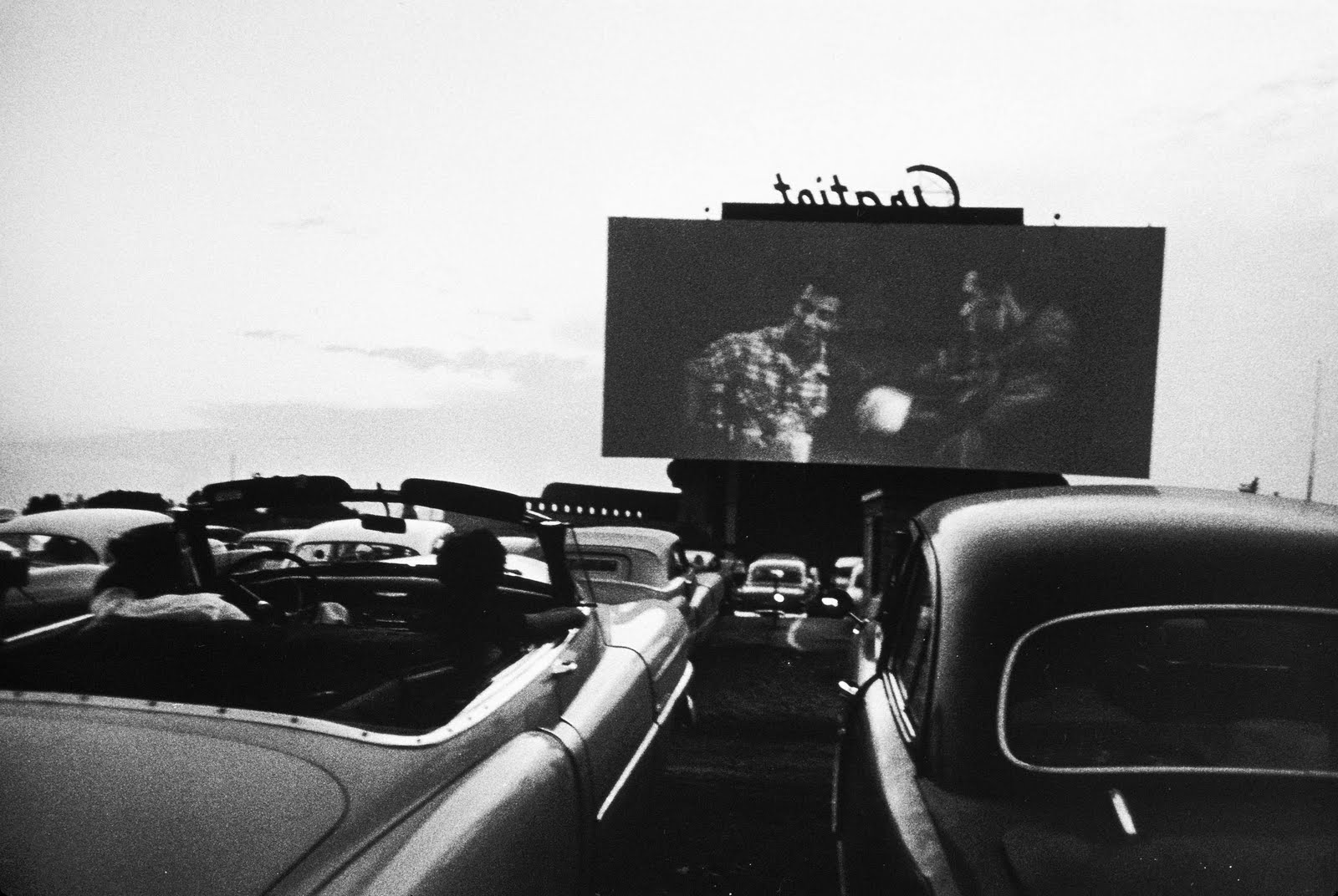 Drive-in Movie - Detroit
Robert Frank
E.HEHR 1955 blog
This photograph is part of Robert Frank's collection The Americans. The photograph depicts Frank's idea of American culture at that time. The area between the two cars draws the viewers eye up from the bottom of the frame to the movie screen in the background. Also, the way Frank captured the movie-viewers in the front of the frame and the movie screen in the distance makes it appear as if the photographer is part of the scene. The photograph is also taken at a slight angle which draws the viewer in and makes the scene appear more realistic.
Cheering
 Untitled
George Silk/Time & Life Pictures/Getty Images
life.com
The most interesting aspect of this image is the vantage point from which it was taken. The photographer captured this image not only above the baseball game in the distance but also above the cheering fans. In doing so, the photographer focuses the picture more on the fans rather than on the baseball game. Because the photographer included both the field in the distance and the adoring fans, he creates a sense of excitement for the viewer. The fact that the frame is not separated straight down the middle adds another element of informality and allows the viewer to feel as though he is in the scene of the photograph.
Monday, October 10, 2011
Vibrant Colors

I really like this picture because it captures detail so well and the colors are so vibrant. The contrast between the red and the green makes this picture so alive. The main focus of this picture is the red maple tree, its stems and leaves. This picture was taken in broad daylight because of the vivid color and almost fluorescence feel to it. Even though it is hard to focus on anything else but the red maple tree, one can notice the background which consists of green trees. The main focus of this picture is the stems and leaves of this maple tree. The thin trunk of this tree gives the picture height and makes us wonder how tall this tree is. The lines and space defined by the leaves makes this picture stand out for me. It embraces nature and all its magic in color and composition.
Thursday, October 6, 2011
i heart photograph; Raphael Dallaporta; Antipersonnel Series
 This picture is of a US made Claymore, a device that fires hundreds of steel balls when activated (either by trip wire or remote detonation). What I believe works best in this photo is the direction of the claymore, and the positioning of the text (which is the first thing I examined upon viewing); the fact that it is US made, and that the text is written in English, also seems to strike a poignant cord. Being the most integral part of the photo, I believe the self-explanatory directions on the claymore evoke an array of questions and emotions. Who is the "enemy," why are they "the enemy," and how did they become the "enemy" were the first things that popped into my head. These questions would undoubtedly necessitate a thorough examination of US foreign policy, and I believe this is just what the photographer intended.
 Additionally, this claymore seems to be a little more explicit about its purpose (ultimately death) than a gun would be, and this works well with the previously mentioned introspection that coincides with viewing of the picture.
Tuesday, October 4, 2011
Along the Shore

This picture was taken from the chromasia blog. I love the beach and am missing it right now so I chose this picture to write about this week. The main focus of the picture is of the couple walking along the beach together. It brings a romanctic vibe to the picture. In the background you can see a family and a pier. From this picture you can tell that it is not summer due to the outerwear the people in the picture are wearing and besides the 5 people shown in the picture, the beach looks pretty desolate. This picture works for me because it portrays the beach as a secluded place, not a busy area where people tan and blast music. It makes you feel like you can enjoy the beauty of the beach even if it's not summer. The black and white also bring in a dark mood. I like that the background is the ferris wheel instead of having the ferris wheel as the main focus.
Burchell's Zebras: by Richard du Toit
 This aerial photo of zebras really makes you think how you are observing these zebras. At first glance the actual shadows make it look like the photo was taken from the side and the actual zebras are the shadows. But once you see the details and lack of details in the shadow, you know exactly where this photo was taken from. Even though the color in this photo seems to be very bland, the zebras and their shadows really do jump out at you. It also makes you wonder where this photo was taken and where the zebras are going. Maybe to find water or to find their next meal. Overall, Richard du Toit has some fabulous aerial photography that really stands out among others.
Sunday, October 2, 2011
A Morning in the East Village

A Morning in the East Village
Dane Shitagi
Ballerina Project (July 11, 2010)
What strikes me most about this photograph is the strength of the dancer's pose. Even though the dancer is petite, her presence in the photograph is accentuated by the strength that she displays. She is surrounded by large buildings and wide expanses of road, yet she is not lost amongst her immense surroundings. The photograph's focus on the dancer is emphasized because the photographer centered the dancer within the frame. Also, the color of the dancer's dress coordinates with the color of the pedestrian traffic light that she is hanging from. This causes the dancer to appear as though she is as strong as the buildings and other durable structures surrounding her.
Subscribe to:
Posts (Atom)